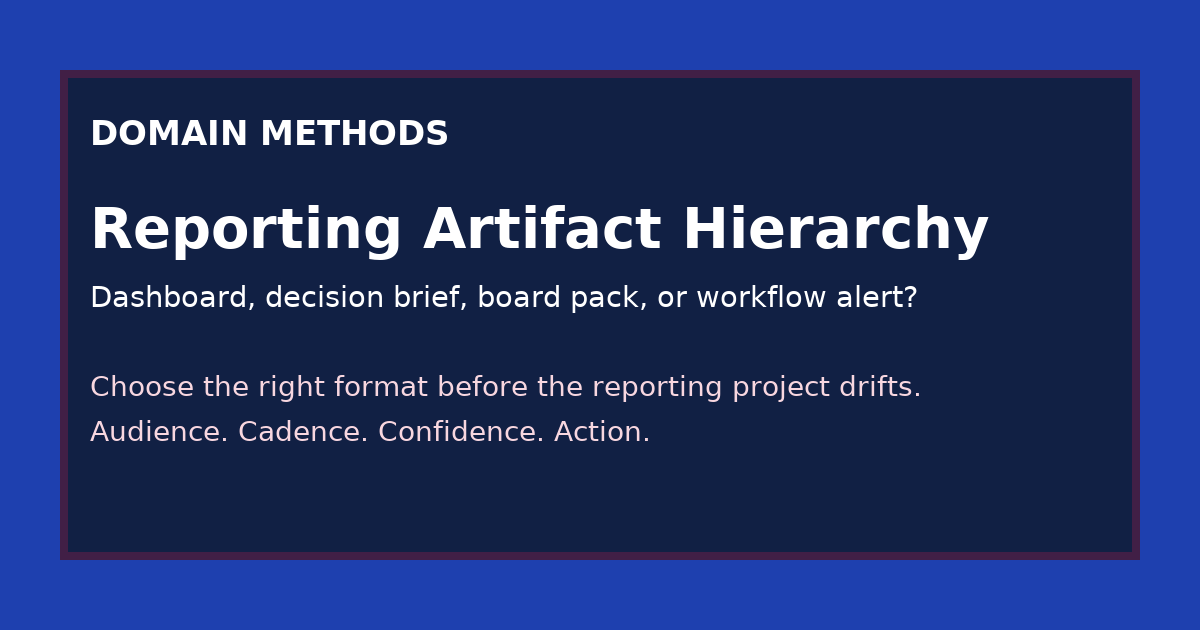
The Reporting Artifact Hierarchy: Dashboard, Decision Brief, Board Pack, or Workflow Alert?
- Jason B. Hart
- Revenue Operations
- April 17, 2026
- Updated April 21, 2026
Table of Contents
What is the reporting artifact hierarchy?
The reporting artifact hierarchy is a practical way to choose whether a team needs a dashboard, a decision brief, a board pack, or a workflow alert based on audience, cadence, confidence requirement, and downstream action.
A lot of reporting projects go wrong before anyone opens Looker, writes SQL, or starts designing slides.
They go wrong at the naming step.
Someone says, “We need a dashboard.” Someone else thinks, “We need a board update.” A third person wants a clean recommendation for one budget call. And the ops team quietly hopes the output will become a trigger inside a workflow.
Those are not the same job.
Treating them like the same job is how teams end up solving a board problem with a dashboard, an operating problem with a slide deck, or a workflow problem with an executive summary.
That mismatch is expensive because it creates the illusion of progress. The artifact exists. The meeting happens. The screenshot looks polished. But the output still does not fit the decision.
Why the artifact choice matters more than teams think
The wrong reporting artifact usually creates one of four failure modes:
- the audience gets too much information and still cannot act
- the audience gets too little context and over-trusts the number
- the team builds something recurring for a one-time decision
- the team builds something narrative when the real need is an operational trigger
This is why reporting work feels deceptively slippery in mid-size SaaS companies.
The request sounds concrete, but the underlying need is still mixed together.
One leader wants a board-safe story. One operator wants a weekly read on what to change. One team wants a documented recommendation with tradeoffs. One workflow owner wants a signal to route work automatically.
If you do not separate those needs early, the artifact starts absorbing every stakeholder anxiety at once.
That is when a reporting project becomes a junk drawer: too broad for operators, too thin for executives, too static for workflows, and too vague for real decision-making.
The four artifact types
Here is the simple hierarchy I use.
1. Dashboard
A dashboard is for recurring visibility.
It works best when the audience returns to the same metric family repeatedly and needs to inspect movement, segment performance, or operational drift over time.
Good dashboard use cases:
- weekly paid channel review
- pipeline movement by segment
- lifecycle funnel monitoring
- source-to-revenue trend inspection
A dashboard is a poor fit when the real need is a recommendation, a board narrative, or an action trigger.
2. Decision brief
A decision brief is for one bounded call.
It should answer a specific question, show the relevant evidence, state the confidence level, surface tradeoffs, and end with a recommendation or at least a decision-ready frame.
Good decision brief use cases:
- should we reallocate budget this month?
- should we trust this pipeline gap enough to change forecast posture?
- should we pause this channel, fix the definition, or wait one more week?
The mistake I see often is trying to solve this with a dashboard. That forces the reader to reverse-engineer the recommendation from raw views instead of getting a tight argument.
3. Board pack
A board pack is for executive narrative under a higher confidence bar.
It needs fewer numbers than most teams think, but much sharper framing around what changed, what leadership should believe, and what the caveats mean for risk.
Good board pack use cases:
- quarterly revenue and pipeline story
- marketing efficiency narrative for investors or board members
- major change in forecast confidence
- explanation of why a trusted metric moved or should be reinterpreted
A board pack is not just a nicer dashboard export. It has to translate operating detail into decision-grade or board-grade narrative.
4. Workflow alert
A workflow alert is for a defined downstream action.
It only makes sense when a signal should cause someone or some system to do something next.
Good workflow alert use cases:
- route a high-priority account for human review
- flag a pipeline anomaly for RevOps investigation
- trigger a check when spend efficiency crosses a threshold
- alert a team that a data quality issue now threatens a live operating metric
A workflow alert is the wrong answer when the business has not decided who owns the response, what threshold matters, or how false positives should be handled.
The reporting artifact hierarchy at a glance
| Artifact | Best audience | Typical cadence | Confidence bar | Best for | Common failure mode |
|---|---|---|---|---|---|
| Dashboard | Operators, managers, analysts | Daily to weekly | Directional to decision-grade | Recurring visibility, exploration, monitoring | Used as a substitute for recommendation or executive narrative |
| Decision brief | One decision-maker or small working group | As needed | Decision-grade | Bounded calls, tradeoffs, recommendations | Overbuilt into a recurring reporting product nobody reuses |
| Board pack | Executives, board, investors | Monthly to quarterly | Board-grade | Strategic narrative, risk framing, aligned interpretation | Stuffed with operating detail that obscures the real message |
| Workflow alert | System owner, RevOps, operator responsible for action | Near real time to daily | Decision-grade on the trigger, plus explicit fallback handling | Triggering an action, escalation, or human review | Shipped before thresholds, ownership, or exception handling are clear |
A fast way to choose the right artifact
If the team is stuck, answer these four questions in order.
Who needs the output?
If the answer is “everyone,” the request is still too fuzzy.
A dashboard for operators, a board pack for executives, and a workflow alert for a system owner are not interchangeable. Naming one audience often eliminates two artifacts immediately.
How often will this be used?
This is where teams accidentally create recurring reporting for a one-time decision.
If the question only matters for one planning cycle, campaign shift, or leadership call, a decision brief is usually enough. Building a full dashboard for that moment often creates maintenance cost without creating reuse.
What confidence level does the use case require?
This matters more than visual polish.
A weekly operating view can survive directional caveats. A budget reallocation decision usually needs decision-grade confidence. A board narrative needs a board-grade bar plus explicit treatment of caveats and known gaps, which is why How to Present Marketing Data to Your Board, Including What You Don’t Know is a useful companion to this hierarchy. A workflow alert needs enough trust that the next action is worth the interruption or automation risk.
What happens after someone sees it?
This is the fastest diagnostic question I know.
If nobody can say what happens next, the artifact is probably too generic.
- if the next step is exploration, you probably need a dashboard
- if the next step is a call, you probably need a decision brief
- if the next step is executive interpretation and alignment, you probably need a board pack
- if the next step is a trigger inside a process, you probably need a workflow alert
What goes wrong when you pick the wrong artifact
When a dashboard is used for a board problem
The deck gets crowded with unresolved detail.
Leaders see too many cuts, too many caveats, and too much operating noise. The conversation drifts into metric mechanics when the real need was a sharp story about trend, risk, and what changed.
When a board pack is used for an operator problem
The team gets narrative without control.
Operators still need to inspect the segments, thresholds, and movement behind the conclusion. A board-ready story rarely gives them enough room to work the problem live.
When a dashboard is used for a decision brief
Nobody owns the recommendation.
The room stares at charts and each stakeholder tells a different story about what they imply. The analysis exists, but the decision stays socially unassigned. That is the exact failure mode behind How to Translate Business Questions Into Data Requirements, and it is also why Should This Dashboard Request Be a Dashboard, a Decision Brief, or a Workflow Change? is such a practical follow-on when the intake request itself is still muddy.
When a workflow alert is used before ownership is clear
This is where teams get burned fastest.
The alert fires, but no one trusts it enough to act, or worse, the team automates a response nobody is prepared to audit. In practice, the hard part is not building the trigger. It is deciding what threshold matters, who reviews exceptions, and what to do when the signal is wrong on a Thursday afternoon before a leadership meeting.
A worked example: one problem, four possible artifacts
Imagine the business says: “Pipeline quality feels worse, and leadership wants clarity before the next forecast review.”
That one sentence can point to four different artifact choices.
| Need behind the request | Right artifact | Why |
|---|---|---|
| RevOps needs to inspect trend, segment, owner, and stage movement each week | Dashboard | The team needs recurring visibility and room to inspect the moving parts |
| The CRO needs a recommendation on whether the pipeline dip is a real forecast risk or a reporting artifact | Decision brief | The call is bounded and needs evidence, caveats, and a recommendation |
| The CEO and board need a concise explanation of what changed in pipeline quality and what confidence to place on the number | Board pack | The job is narrative and confidence framing, not open-ended exploration |
| A pipeline-quality threshold should trigger human review on specific segments or accounts | Workflow alert | The job is action routing with explicit ownership and threshold logic |
The phrase “we need reporting” hides all of that.
The artifact hierarchy forces the team to say which job it is actually doing.
The operator mistake to avoid
The most common mistake is not choosing the “wrong” artifact in an abstract sense.
It is choosing the most socially acceptable artifact.
Dashboards often win because they sound concrete, neutral, and reusable. Board packs get requested because they sound executive. Workflow alerts sound modern and efficient. Decision briefs get skipped because they feel temporary.
But temporary is sometimes exactly right.
A temporary decision brief is better than a permanent dashboard nobody uses correctly. A plain board pack is better than a 14-tab export that still leaves the board unconvinced. A human-reviewed workflow alert is better than a polished automation nobody owns.
The right artifact is the narrowest one that can carry the decision with the right confidence and next-step clarity.
Use this hierarchy before the project starts, not after it drifts
By the time a reporting project is already late, overloaded, and politically messy, the artifact question gets harder to unwind.
That is why I like forcing four inputs before the work starts:
- audience
- cadence
- confidence requirement
- downstream action
If those are explicit, the right artifact usually becomes obvious.
If they are not explicit, the reporting request is still a translation problem.
That is the signal to pause the build conversation and get the operating question clear first.
Download the Reporting Artifact Hierarchy Worksheet (PDF)
Use this one-page worksheet to match a reporting request to the right artifact before your team burns time building the wrong thing. It includes the audience, cadence, confidence, downstream action, and failure-mode prompts from this article.
Instant download. No email required.
Want future posts like this in your inbox?
This form signs you up for the newsletter. It does not unlock the download above.
The real point
A lot of reporting pain is not caused by missing charts.
It is caused by teams using the wrong artifact for the job and then trying to compensate with more design, more tabs, or more explanation.
The fix is usually simpler than that.
Name the audience. Name the cadence. Name the confidence bar. Name the action. Then choose the artifact that fits the decision instead of the artifact that sounds familiar.
If your team keeps saying “dashboard” when the real ask is still fuzzy, start with Translate the Ask. If the artifact conversation keeps exposing trust fights between teams, Three Teams, Three Numbers is usually the better next move.
Sources
- Salesforce, State of Data and Analytics, Second Edition. Salesforce reported that 63% of data and analytics leaders struggle to drive business priorities with data, and only 49% say they can generate timely insights reliably. https://www.salesforce.com/news/stories/state-of-data-and-analytics-report/. Accessed 2026-04-17.
Download the Reporting Artifact Hierarchy Worksheet (PDF)
A one-page worksheet for matching audience, cadence, confidence level, and downstream action to the right reporting artifact before a reporting project starts.
DownloadIf the request still sounds like 'we need better reporting'
Translate the Ask
Use the sprint when the business knows it needs clarity, but the decision, audience, confidence bar, and artifact shape are still getting blurred together.
See the translation sprintIf the hierarchy reveals a trust fight, not just an artifact choice
Three Teams, Three Numbers
When marketing, sales, finance, and data want different outputs because they trust different numbers, start by mapping the definition split before redesigning the reporting layer.
See the metric-alignment diagnosticSee It in Action
Common questions about dashboards, board packs, and reporting artifacts
When should a team use a dashboard instead of a decision brief?
What makes a board pack different from normal reporting?
When is a workflow alert the right reporting artifact?
Why do reporting projects drift so easily?

About the author
Jason B. Hart
Founder & Principal Consultant
Helps mid-size SaaS companies turn messy marketing and revenue data into decisions leaders trust.